Introduction
In this piece I’m going to describe the technical aspects behind a recent project where I wrote about the geography of Oklahoma State football’s recruiting practices. This project involves extracting web content, processing text, geocoding, web mapping, and some basic exploratory spatial data analysis. I met a number of unexpected challenges along the way and I hope this will serve to help others facing similar issues. These scripts are also available in full in a repository on GitLab.
Extracting and processing text from the web
Initially I was planning on just using the rosters provided on Oklahoma State’s website, but this proved to be problematic for several reasons: (1) each year’s roster lists every player on the team and does not stratify by signing class; (2) Oklahoma State’s online rosters are only available from 2015 - 2019; (3) and they use a weird state abbreviation system that doesn’t work well with geocoders. Kyle Porter from Pistol’s Firing Blog suggested I try Rivals or 247 Sports, and Rivals had exactly what I was looking for: a list of recruits for each year dating back to 2002.
In the snippet below I load libraries, set my working directory and extract some raw data from my GitLab page. These are state (for the U.S.) and province (for Canada) abbreviations that are matched to abbreviations on Rivals and used to improve geocoding results.
  library(httr)
  library(rjson)
  library(magrittr)
  library(ggmap)
  library(purrr)

  # set working directory
  setwd("/home/matt/git-repos/okstate-fb-recruiting/data/")

  # get state abbreviations from the web and convert to data frame
  states.df <- data.frame(read.csv("https://gitlab.com/mhaffner/useful-files/raw/master/state-abbreviations.csv",
                                   strip.white = TRUE,
                                   stringsAsFactors = FALSE))
Even though Rivals contains data on Oklahoma State’s rosters back to 2002, I only use 2006 - 2019 which covers Gundy’s tenure as head coach. His first year was 2005, but his first recruiting class would have been 2006. Conveniently, the early signing period for 2019 has already occurred, and with OSU’s 20 commitments (19 signees and 1 verbal commitment) not much will change on February 6, National Signing Day.
years <- c(2006:2019)The next part is a loop broken into multiple chunks for readability. In here
there is some text parsing/processing, geocoding, and aggregation. First, I loop
through every year in the previously declared variable, years, which creates a
link for each signing class with the page variable.
for (year in years) {
  page <- paste0("https://oklahomastate.rivals.com/commitments/Football/", year)
What follows is how I turned the web table from rivals into a data frame.
Typically, using a library like rvest is ideal since it can simplify much of
this process using CSS selectors. Unfortunately though, the tables on Rivals are
generated using JavaScript, not created with pure HTML. This is problematic
since the page takes some time to load, and the JavaScript content is
inaccessible with rvest in such circumstances.
There are ways of getting around this that are a bit more involved, but they
require more work up-front (e.g., R packages splashr and RSelenium). For
more long-term projects, these would certainly be more appropriate, but for my
sake, simply extracting all text content from the page and parsing it on the
back end is sufficient since Rivals’ content is predictable and the tables don’t
vary in structure from year to year. I’m not sure why a simple GET request
with the httr package works for extracting the JavaScript-created tables but
rvest functions do not:
  ### create data frame
  # get the webpage content
  players.df <- GET(page) %>%
    # convert content to text
    content(., "text") %>%
    # split by the json's front end
    strsplit(., "rv-commitments prospects=") %>% extract2(1) %>% extract2(2) %>%
    # split by the json's back end
    strsplit(., "</rv-commitments") %>% extract2(1) %>% extract2(1) %>%
    # do a little more parsing
    strsplit(., paste0("sport='football' team-ranking='teamRanking' year='", year,"'>")) %>%
    # parse by character position; basically strip out > and <
    substr(., 2, nchar(.)-2) %>%
    # convert from json
    fromJSON() %>%
    # convert NULLs to NA, list items to data frame columns (character and numeric) and create tibble
    map_df(., flatten)
Here, I make extensive use of the pipe function, %>%, which has become a
staple of mine lately. While it can be a bit confusing at first, it ultimately
makes for much more transparent workflow and cleaner code. In the code above, a
period is frequently used as an argument (e.g., content(., "text") %>%), which
simply means “the thing (or object) from the previous pipe.” What was puzzling
to me initially is that with functions where only one argument is required, the
period is not needed, so it is usually omitted (e.g. some_func() %>%).
The pipe also requires some alternative function use, like extract2() used in
place of indexing, which does not work with pipes. Essentially %>% extract2(1) %>% extract(2) means my_obj[1][2]. Then, the use of strsplit to get what I
needed simply required a bit of trial and error.
Next, I geocoded (i.e. attached geometry to locations based on text) the
players’ hometowns so that they could be mapped. I was originally using the
nominatim package for this, but it was inappropriate on a few different
levels: (1) it is a bit overkill for the simple purpose of getting cities’
latitude/longitude locations; the nominatim package relies on OpenStreetMap
which contains hundreds of different feature types. (2) nominatim requires an
API key and has query limits. While I was not close to hitting the limit in this
project, I very well could hit it in similar projects in the future. (3) While
all geocoders occasionally produce erroneous results, nominatim produced more
errors for me. Given that I only need to geocode city locations and that
precision is not a major concern, ggmap is a better choice.
Even with ggmap, however, it is better to use full state or province names
rather than state abbreviations. Canadian provinces and their abbreviations were
required in addition to U.S. states, since Oklahoma State attracts a wealth of
players from the Great White North. These are matched and assigned using the
match function.
  # match results based on table indices
  players.df$state <- states.df$state[match(players.df$state_abbreviation, states.df$abbrev)]

  # create a field of city, state
  players.df$home.town <- paste0(players.df$city, ", ", players.df$state)

  # use ggmap geocoder to get geometry
  home.town.loc <- geocode(players.df$home.town, output = "latlon", source = "dsk")

  players.df$lon <- home.town.loc$lon
  players.df$lat <- home.town.loc$lat
I then create a data frame out of the first year’s data and append the rows of
each year’s recruits to the previous. This does not feel very efficient or
R-like, but it gets the job done. Note that the apparent mismatched bracket is
paired at the top of the for loop.
  # append dataframe rows
  if (year == min(years)){
    agg.df <- players.df
  } else {
    agg.df <- rbind(agg.df, players.df)
  }
}
Finally, I write the results to a file since the geocoding takes a while and this only needs to be done once.
# save the .csv to a file
write.csv(agg.df, "osu-recruits.csv", row.names = FALSE)
Mapping all recruits
For this part, some different libraries are needed. In my repository this is
actually the start of a separate script, but for the sake of brevity I omit
redundant lines (e.g., setwd). The library randomcoloR is used first to
assign colors to points. Selecting 14 distinct yet visually appealing colors is
surprisingly difficult, but the randomcoloR library does this quite well. As
the name implies, it generates colors randomly, so I use set.seed(3) to “fix”
the scheme to what I deemed desirable. I tested other schemes with set.seed(1)
and set.seed(2), but didn’t like these as much. Fixing the color scheme is
important since I want to use the same color scheme on every map which is each
in a different scripts. I simply use set.seed(3) prior to the line with the
distinctColorPalette function, and this replicates my desired scheme. This
only needs to be done once, and I save the result as an R dataset to avoid
having to set.seed(3) in each other script.
library(randomcoloR)

set.seed(3)
color.pal <- sample(distinctColorPalette(length(years)))

# save colors for future use
saveRDS(color.pal, file="colors.Rda")
The R library leaflet is used to create the web maps. First, I load the data.
# load data
library(leaflet)
recruits <- data.frame(read.csv("osu-recruits.csv"))
Next, I create a variable containing the years of the study. Rather than do this
manually with years <- 2006:2019, I simply extract the unique years from the
necessary column in the recruits data frame.
# get unique years as a variable
years <- unique(recruits$year)
To create the web maps I use the leaflet package which has great documentation
and is pleasantly intuitive. It blows my mind how much easier it is to create
web maps in R rather using pure html and JavaScript. Plus, using R makes a
wealth of statistical and spatial analysis capabilities available directly, and
frameworks like Shiny and RMarkdown make creating production quality web maps
totally viable. Since discovering this combination of packages, my mind has been
reeling with potential applications.
Creating web maps is another place where using pipes makes sense, since each
line adds something new to the map – sort of like creating a layer in a desktop
GIS – and avoids having to repeatedly declare a map variable. The code below
creates a simple base map with the view fixed in a location that makes all data
points visible. I use Stamen’s Toner tiles (as opposed to the default Open
Street Map tiles) which use only black to avoid conflicts with the 14 different
colors of the points.
# load color scheme
color.pal <- readRDS("colors.Rda")

# create color palette with domain
colors <- colorFactor((color.pal),
                      domain = c(min(years):max(years)))

map <- leaflet(width = "100%", height = "650px") %>%
  addProviderTiles(providers$Stamen.Toner) %>%
  setView(lng = -98.33, lat = 38.37, zoom = 4)
Following this, I use a loop (solution found on Stack Overflow) to
create a separate layer for each year. This is only necessary since I
am using overlayGroups to create selectable layers. I make some
modifications to the default styles like lowering the opacity to give
a sense of density. Using an even lower opacity (e.g., 0.2) does
this better but makes distinguishing colors more difficult. If the
point of this project was to show hotbeds of recruits over Gundy’s
entire tenure (i.e. not from year to year), something like kernel
density estimation would certainly be a better visualization tool.
for (year in years) {
  data <- recruits[recruits$year == year,]
  map <- map %>%
    addCircleMarkers(data = data,
                     lng = ~lon,
                     lat = ~lat,
                     radius = 7,
                     stroke = FALSE,
                     color = ~colors(year),
                     fillOpacity = 0.8,
                     group = as.character(year))
  }
Even with this code above, the map is still not displayed. This final snippet displays the map, adds layer control, and adds a legend.
map %>%
  addLayersControl(
    overlayGroups = years,
    options = layersControlOptions(collapsed = TRUE)) %>%
    addLegend("bottomleft", pal = colors, values = years, opacity = 1)
Recruits’ hometowns (2006 - 2019)
Originally I used popup markers so that you could click on a point and see the player’s name and hometown, but since multiple players can come from the same town, there are many overlapping points. From what I can see, Leaflet has no effective way of handling these, and you can only click on the top point. I was a bit confused before I realized this - clicking on Tulsa, I did see Justice Hill, for instance. To avoid confusion I just omitted this feature.
Measures of central tendency and dispersion
Though this web map is fun to play around with, it does not tell us anything definitive about patterns over time. Humans are notoriously bad at detecting spatial patterns visually, which works out well for me as it provides job security. Due this, I use several metrics: mean center, median center, and standard deviation.
Mean centers
The mean center is a straightforward measure that simply averages the longitude and latitude values (separately, of course). Using a geographic coordinate system always necessitates caution, since distance calculations often don’t work as intended – a degree of latitude and a degree of longitude are unequal except at the equator. In this case, however, the latitude and longitude means are calculated separately, so this conniption does not pose any problems.
  # get the mean center for each year
  mean.centers <- data.frame(year = years, lon = NA, lat = NA)

  for (year in years) {
    mean.centers$lon[mean.centers$year == year] <- mean(recruits$lon[recruits$year == year])
    mean.centers$lat[mean.centers$year == year] <- mean(recruits$lat[recruits$year == year])
  }
This time I set the view programmatically based on the data’s mean
center. Yet, this cuts off view of the year 2016 which lies farther
north than any other point, so I add 0.4 to the starting latitude
view. I use the same color scheme as before, but I leave the opacity
alone since there are no overlapping points.
  # create map of mean centers
  leaflet(width = "100%", height = "500px") %>%
    addTiles() %>%
    setView(lng = mean(mean.centers$lon), lat = mean(mean.centers$lat)+0.4, zoom = 7) %>%
    addCircleMarkers(data = mean.centers,
                     lng = ~lon,
                     lat = ~lat,
                     label = ~as.character(year),
                     labelOptions = labelOptions(noHide = TRUE,
                                                 direction = "bottomleft"),
                     radius = 7,
                     stroke = FALSE,
                     color = ~colors(year),
                     fillOpacity = 1)
Mean centers of recruits’ hometowns (2006 - 2019)
Median centers
Due to the intermittent recruits from California, the Northeast, and Canada – Chuba Hubbard’s hometown, for example, lies at a whopping 53.5 degrees north – mapping the median center is a good idea as this metric reduces the influence of outliers. This code is identical to the previous except that it calculates medians instead of means. I still use the mean center (plus the same minor correction mentioned earlier) to generate the starting view so that the two are consistent.
# get median center for each year
median.centers <- data.frame(year = years, lon = NA, lat = NA)

for (year in years) {
  median.centers$lon[median.centers$year == year] <- median(recruits$lon[recruits$year == year])
  median.centers$lat[median.centers$year == year] <- median(recruits$lat[recruits$year == year])
}

leaflet(width = "100%", height = "500px") %>%
  addTiles() %>%
  setView(lng = mean(mean.centers$lon), lat = mean(mean.centers$lat)+0.4, zoom = 7) %>%
  addCircleMarkers(data = median.centers,
                   lng = ~lon,
                   lat = ~lat,
                   label = ~as.character(year),
                   labelOptions = labelOptions(noHide = TRUE,
                                               direction = "bottomleft"),
                   radius = 7,
                   stroke = FALSE,
                   color = ~colors(year),
                   fillOpacity = 1)
Median centers of recruits’ hometowns (2006 - 2019)
Dispersion
Using the median significantly reduces the amount of east-west variability and makes 2009 and 2016 stand out from the other years. However, this approach does not consider dispersion. If Oklahoma State received all of its recruits from Dallas during one year and zero recruits from Dallas during another year, the two could still have the exact same mean or median center. I compare standard deviation of distance from Stillwater by year in a later chart, but I thought it would be useful to visualize dispersion by creating lines from Stillwater to every recruits’ hometown.
This process also requires some different libraries, particularly for creating
lines (e.g., the st_cast function from sf) and converting units
(udunits2). Advantageously, this approach displays both distance and direction
from Stillwater. It should be noted that the sf library utilizes geodetic
distance by default when a geographic coordinate system is used.
  library(sp)
  library(sf)
  library(udunits2)

  multipoints <- st_multipoint(as.matrix(recruits[,c("lon", "lat")]))
  points <- st_cast(st_geometry(multipoints), "POINT")

  # create point for just stillwater
  stillwater <- st_geometry(st_point(c(-97.0665, 36.1257)))
  st_crs(stillwater)  <- "+init=epsg:4326"


  for (k in years) {
    multipoints <- st_multipoint(as.matrix(recruits[,c("lon", "lat")][recruits$year == k,]))
    points <- st_cast(st_geometry(multipoints), "POINT")
    st_crs(points)  <- "+init=epsg:4326"

    for (i in 1:length(points)) {
      # combine each point with stillwater to make a pair of points
      pair <- st_combine(c(points[i], stillwater))
      dist <- st_distance(points[i], stillwater) %>%
        # convert from meters to miles
        ud.convert(., "m", "mi")

      # create a line from this pair of points
      line <- st_cast(pair, "LINESTRING")

      # combine lines into multilinestring for plotting and combine distances
      # together for computations
      if (i == 1) {
        lines <- line
        distances <- dist
      } else {
        lines <- st_combine(c(lines, line))
        distances <- append(distances, dist)
      }
    }

    ### distances ###
    # append to dataframe
    if (k == min(years)) {
      dist.df <- data.frame(distance = as.numeric(distances), year = k)
    } else {
      tmp.df <- data.frame(distance = as.numeric(distances), year = k)
      dist.df <- rbind(dist.df, tmp.df)
    }

    ### lines ###
    # covert to sp object
    lines.sldf <- sf:::as_Spatial(lines)

    # assign year to column
    lines.sldf$year <- k

    if (k == min(years)) {
      lines.all <- lines.sldf
    } else {
      lines.all <- rbind(lines.all, lines.sldf)
    }
  }

  # load color scheme
  colors <- readRDS("colors.Rda")

  # set up plot space
  par(mfrow=c(5,3))
  par(mar = c(2,2,2,2))

  # plot lines, each on a separate space
  for (i in 1:length(lines.all$year)) {
    plot(lines.all[lines.all$year == lines.all$year[i],],
         col = colors[i])
         #xlim = c(bbox(lines.all)[1],bbox(lines.all)[2]), # this looks really weird
         #ylim = c(bbox(lines.all)[3],bbox(lines.all)[4]))
    title(years[i])
  }
Distance and direction of recruits’ hometowns to Stillwater
## Warning in CPL_gdal_init(): GDAL Error 1: libpodofo.so.0.9.8: cannot open
## shared object file: No such file or directory

## Warning in CPL_gdal_init(): GDAL Error 1: libpodofo.so.0.9.8: cannot open
## shared object file: No such file or directory

## Warning in CPL_gdal_init(): GDAL Error 1: libpodofo.so.0.9.8: cannot open
## shared object file: No such file or directory

## Warning in CPL_gdal_init(): GDAL Error 1: libpodofo.so.0.9.8: cannot open
## shared object file: No such file or directory
## Warning in CPL_crs_from_input(x): GDAL Message 1: +init=epsg:XXXX syntax is
## deprecated. It might return a CRS with a non-EPSG compliant axis order.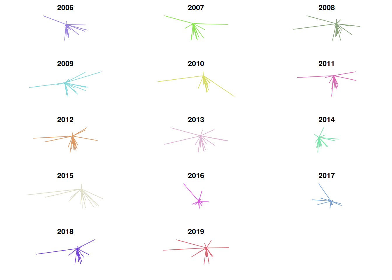
One problem incurred here is that the scale is not consistent from plot to plot. This makes it look as though the distance from Stillwater is low in 2014, when in reality its standard deviation is low but its median distance from Stillwater is the greatest in the entire set. Due to this, I think it’s useful to visualize mean distance, median distance, and standard deviation on a line graph as well. There were some weird formatting issues with the image, so I saved it as a .png instead of rendering it within the .Rmd directly.
# create vectors of means, medians, and standard deviation by year
mean.dist <- tapply(dist.df$distance, dist.df$year, mean)
median.dist <- tapply(dist.df$distance, dist.df$year, median)
sd.dist <- tapply(dist.df$distance, dist.df$year, sd)

# create data frame of these three vectors
summary.df <- data.frame(mean = mean.dist,
                         median = median.dist,
                         sd = sd.dist)

png("../img/summary.png",
    width = 800,
    height = 800,
    units = "px",
    res = 110)
plot.new()
par(mfrow=c(3,1))
par(mar = c(4,4,4,4))

# plot for mean
plot(summary.df$mean,
     type = "l",
     xlab = "",
     ylab = "Distance (miles)",
     xaxt = "n", # remove xaxis labels; add them in the next line
     xaxs = "i") # remove excess space in the plot
title("Mean distance from Stillwater")
labs <- years
axis(side=1, labels=labs, at=c(1:length(years)))

# plot for median
plot(summary.df$median,
     type = "l",
     xlab = "",
     ylab = "Distance (miles)",
     xaxt = "n", # remove xaxis labels; add them in the next line
     xaxs = "i") # remove excess space in the plot
title("Median distance from Stillwater")
labs <- years
axis(side=1, labels=labs, at=c(1:length(years)))

# plot for standard deviation
plot(summary.df$sd,
     type = "l",
     xlab = "",
     ylab = "Distance (miles)",
     xaxt = "n", # remove xaxis labels; add them in the next line
     xaxs = "i") # remove excess space in the plot
title("Standard deviation of distance from Stillwater")
labs <- years
axis(side=1, labels=labs, at=c(1:length(years)))
dev.off()
Mean, median, and standard deviation of recruits’ distance from Stillwater

From these, it’s difficult to see any meaningful trend in the data. While 14 years as a head coach is a long time in the world of NCAA football, from a statistical perspective it’s not a large sample size. It would be nice to examine trends with more data from the past, but Rivals only reaches back to 2002.