I recently authored a book chapter titled “Twitter”, which will be appearing in the Handbook on Geographies of the Internet edited by Barney Warf. For this chapter I created a map of 10,000 tweets in Europe symbolized by language. James Chesire’s work on Twitter Tongues was the initial inspiration for this approach.
Most of my visualizations with spatial data are optimized for the web using R
packages like leaflet or openlayers, but since this work will be appearing
in print it required a different approach. During my dissertation I used the R
package cartography, but based on the number of points required for this map I
decided ggplot2 would be a better choice.
I’ve created many non-spatial visualizations with ggplot2 before, but to my
surprise the experience of visualizing spatial data with it was not much
different. It took a while to figure out a few elements – especially the legend
– but other than that it was pretty straightforward. One unexpected twist
however, was the requirement that the map not use colored points for the
languages since the book will be printed in black and white. But thanks to an
editorial assistant’s suggestion, her patience with my stubbornness, and
ggplot2’s numerous plotting options, this was resolved quite easily.
I collected this data over the course of several days and then sampled 10,000
points from the resulting dataset. For this, I use the Python module tweepy
and the NoSQL system ElasticSearch. After extracting the tweets, the remainder
of the analysis/mapping was completed in R.
First, I attach packages and load the data. I use the rnaturalearthdata
package for country borders and create a vector of the language codes of
interest. Some languages excluded due to spareness. Others, like Finnish, are
excluded due to the ill effect of bot accounts producing unnatural (and
unsightly) patterns on the map.
library(sf)
library(here)
library(dplyr)
library(ggplot2)
library(rnaturalearth)
library(rnaturalearthdata)
library(magrittr)

## get world polygon for background
world <- ne_countries(scale = "medium", returnclass = "sf")

## create variable of languages of interest
langs <- c("es", "pt", "de", "it", "fr", "nl", "en", "ru", "tr", "sv")

## read tweets, filter by those with the languages of interest
tweets <- st_read(here("data/europe-tweets-10k.geojson"),
                  stringsAsFactors = FALSE) %>%
  filter(lang %in% langs)
Filtering by the desired languages leaves 9313 in the dataset, so
about 93% use one of the ten languages of interest. Setting the argument
stringsAsFactors to FALSE saves a step later, since ggplot2 needs a
character instead of a factor for plotting using a categorical variable.
Next, since the variable tweets is an sf obejct, the lat/lng data is not
present outside of the geometry column. In this case, it’s easiest to get them
as separate variables to use as the x/y locations for mapping later.
## get x/y as variables
lng <- tweets %>%
  st_coordinates() %>%
  extract(,1)

lat <- tweets %>%
  st_coordinates() %>%
  extract(,2)
The next chunk will show the construction of the map object in its entirety. Below, I’ll explain each element individually.
## create map object
map.color <- ggplot(data = world) +
  theme(text = element_text(family = "Source Code Pro"),
        legend.text = element_text(size = 16),
        legend.title = element_text(size = 20)) +
  geom_sf(fill = "white") +
  coord_sf(xlim = c(-24, 50),
           ylim = c(30, max(lat)),
           expand = FALSE) +
  geom_point(data = tweets,
             aes(x = lng,
                 y = lat,
                 color = tweets$lang),
             size = 3,
             alpha = 1/2) +
  xlab("") +
  ylab("") +
  scale_color_discrete(name = "Language",
                       labels = c("German", "English", "Spanish",
                                  "French", "Italian", "Dutch",
                                  "Portuguese", "Russian", "Swedish",
                                  "Turkish"))

## display map
map.color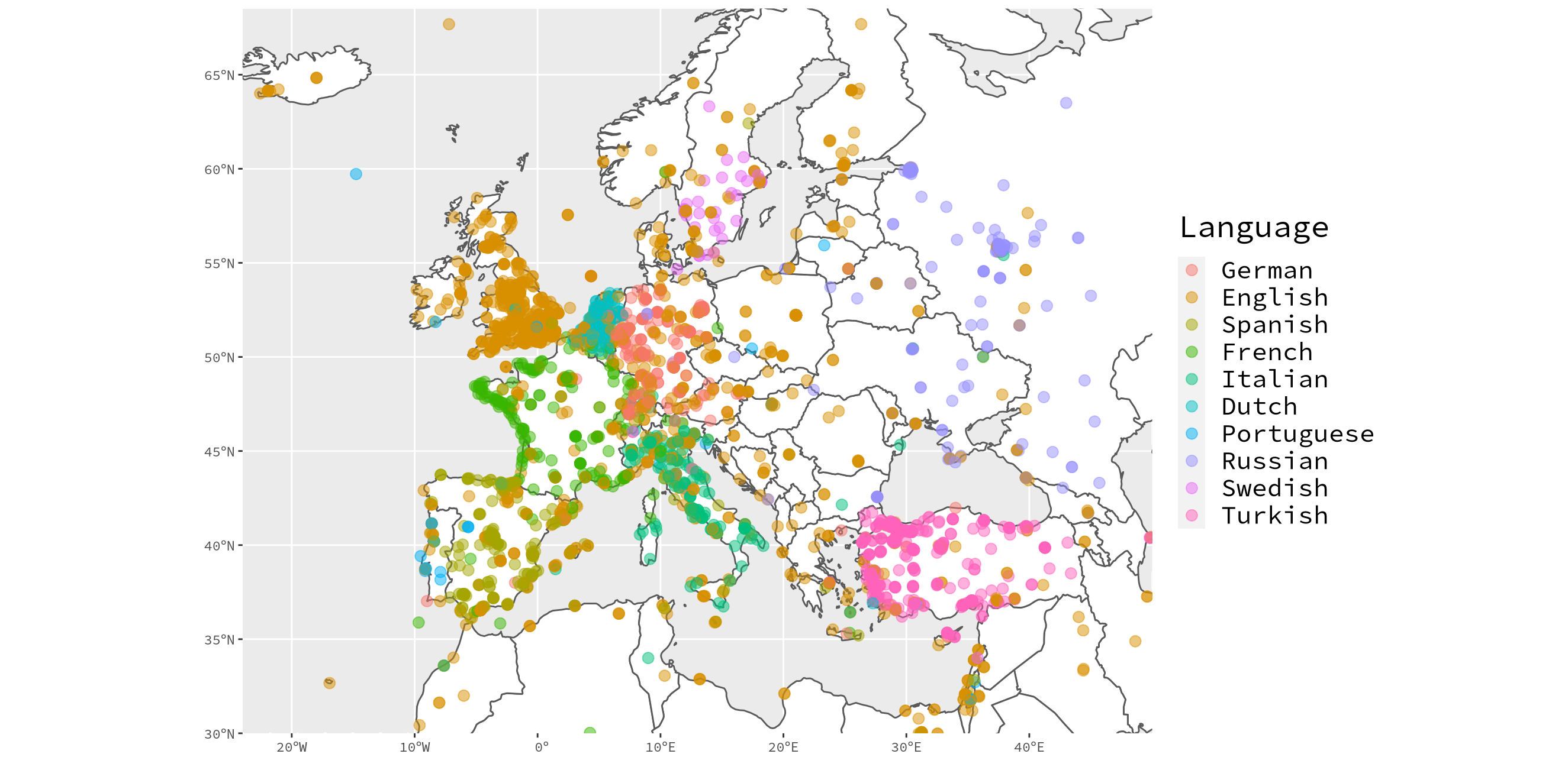
ggplot(data = world): this tells ggplot2 to use theworldpolygons as the primary plotting object.theme(text = ...): I have some weird locale issue on my home computer (I think that’s the issue at least) that prevents the default font from rendering on plots, so I specify explicitly here. Plus, Source Code Pro looks awesome anyway. I use the other arguments to adjust the size up a bit.geom_sf(fill = "white"): this is what adds theworldpolygons to the map. Here,worldis inferred since it is thedataargument passed to theggplotfunction.coord_sf(xlim = ...): this is used to set the view. Originally I was usingmin/maxoflng/lat, but this resulted in a bit too much empty space. So I set three out of the four manually.geom_point(data = ...): The points are added to the map with this function. By setting thecolorargument totweet$lang, it will automatically symbolize the points by this variable.xlab(""): Remove the “lng” label from the x axis.ylab(""): Remove the “lat” label from the y axis.scale_color_discrete(name = ...): Create the legend with manually defined labels. This order should not necessarily match the order of thelangvariable defined earlier; this should match the order of appearance of unique values in thetweets$langcolumn, which can be easily retrieved with
unique(tweets$lang)## [1] "es" "de" "en" "it" "nl" "sv" "fr" "tr" "pt" "ru"I’m not crazy about the color scheme, but after trying various options from
packages like randomcoloR, viridis, RColorBrewer, and wesanderson it was
clear that I was not going to be satisfied without defining my own colors
manually, so I decided to accept ggplot2’s defaults and move on.
One confusing thing about ggplot2 is that you can include some items in the
ggplot chain, and they won’t appear nor trigger an error. For example, I
originally tried to use guides(fill=guide_legend(title="New Legend Title")) to
create the legend title, but I needed to include it in scale_color_discrete
instead. In fact, that line remained in the code until I decided to write this
post!
Back to the drawing (coding) board
After sending this map off to the publisher feeling very accomplished, the editorial assistant responded with concerns that the map would not reproduce well in grayscale. Knowing this would be the case – not that I expected it to be printed any other way – I stated why it was not possible to produce this map without color: (1) using a 10 class grayscale color scheme is not really feasible and (2) the density of the points would ruin any possibility of distinguishing languages from one another. For example, if Turkish tweets were light gray and German tweets were dark gray, three overlapping Turkish tweets would not be distinguishable from one German tweet. My suggestion was to take the map as is, knowing that people could find the color figure online.
Feeling very confident that I was right and that the publisher would listen to
me, I was frustrated to hear that the map was not acceptable. The editorial
assistant then suggested that I use unique icons for the tweets instead, and I
remembered back to my grad school days where I tried darn near every shape
option ggplot2 offers just for the fun of it. For the record, there are 25,
with 14 of those being hollow – more than enough for my ten languages.
I then altered the code a bit to produce this grayscale friendly map. Below the code I highlight the major changes.
map.gray <- ggplot(data = world) +
  theme(text = element_text(family = "Source Code Pro"),
        legend.text = element_text(size = 16),
        legend.title = element_text(size = 20)) +
  geom_sf(fill = "white") +
  coord_sf(xlim = c(-24, 50),
           ylim = c(30, max(lat)),
           expand = FALSE) +
  geom_point(data = tweets,
             aes(x = lng,
                 y = lat,
                 shape = tweets$lang),
             size = 2,
             alpha = 2/5) +
  xlab("") +
  ylab("") +
  scale_shape_manual(name = "Language",
                     values = 1:10,
                     labels = c("German", "English", "Spanish",
                                "French", "Italian", "Dutch",
                                "Portuguese", "Russian", "Swedish",
                                "Turkish"))

## display map
map.gray
geom_point(..., shape = tweets$lang): Here, I symbolize the tweets by language usingshaperather than color – a pretty simple switch. I also adjusted thealphavalue to make the points more transparent and altered thesizeparameter as well.scale_shape_manual(...): Since the map is no longer in color, thescale_color_discretefunction will no longer suffice. Other arguments remain the same with one addition in thevaluesargument.
After creating the map, ggsave can be used to save the last plot.
 ## save
 ggsave(filename = here("img/europe-tweets-gray.jpg"), dpi = 400,
        width = 18.04,
        height = 20)
Conclusion
In the end, I feel like the grayscale map offers a good balance between
depicting the data in a meaningful way and dealing with realistic limitations of
printing. I had to apologize to the editorial assistant for being a bit
stubborn; her suggestion was a good one, and it forced me to learn something new
and cool about ggplot2. In fact, the grayscale map shows some patterns that
not really discernible with the color version, and in the end both suffer from
an overabundance of points in some locations. That said, if I had to choose
between one or the other, color is better when it’s available. Had this been
produced for a web page though, I would have used a different approach
altogether.